
Notice
Recent Posts
Recent Comments
Link
| 일 | 월 | 화 | 수 | 목 | 금 | 토 |
|---|---|---|---|---|---|---|
| 1 | 2 | 3 | 4 | 5 | 6 | |
| 7 | 8 | 9 | 10 | 11 | 12 | 13 |
| 14 | 15 | 16 | 17 | 18 | 19 | 20 |
| 21 | 22 | 23 | 24 | 25 | 26 | 27 |
| 28 | 29 | 30 |
Tags
- es6
- html 엔티티
- Component
- vitre
- asynchronus
- watch
- mobile dev tools
- tdz
- await
- promise
- reactivity
- composition api
- drective
- async
- computed
- synchronus
- ref
- const
- setup 함수
- hoisting
- vue
- watchEffect
- 템플릿 문법
- 티스토리챌린지
- 앱 빌드
- eruda
- composition API
- 오블완
- let
- dex모드
Archives
- Today
- Total
uxtry
cp*: 레이어팝업 본문
아래는 자동 열기 옵션이 있는 Vue 레이어 팝업 컴포넌트로, 모바일에서는 화면 아래에서, PC에서는 화면 가운데에서 팝업이 열립니다.
App.vue
레이어팝업 컴포넌트를 호출하고 내용을 넣을수 있습니다.
<template>
<div>
<!-- 팝업 열기 버튼 -->
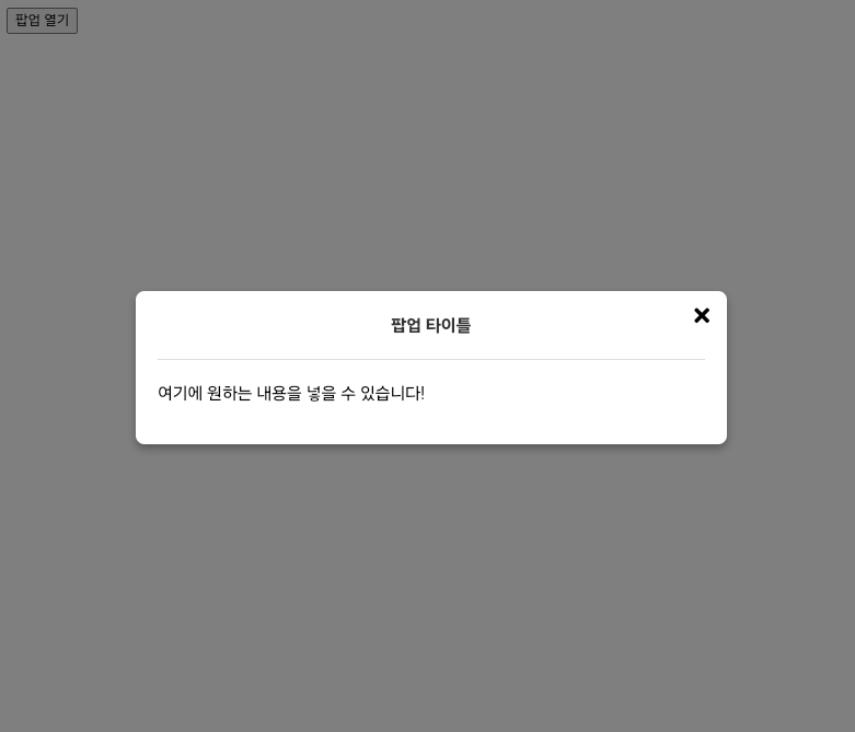
<button @click="openPopup">팝업 열기</button>
<!-- LayerPopup 컴포넌트 -->
<LayerPopup :autoOpen="false" :isOpen="isPopupOpen" @close="isPopupOpen = false" title="팝업 타이틀">
<p>여기에 원하는 내용을 넣을 수 있습니다!</p>
</LayerPopup>
</div>
</template>
<script>
import { ref } from "vue";
import LayerPopup from "./LayerPopup.vue";
export default {
components: {
LayerPopup,
},
setup() {
const isPopupOpen = ref(false);
const openPopup = () => {
isPopupOpen.value = true;
};
return {
isPopupOpen,
openPopup,
};
},
};
</script>
<style>
@import "https://cdnjs.cloudflare.com/ajax/libs/font-awesome/5.8.2/css/all.min.css"
</style>>
LayerPopup.vue
레이어팝업 컴포넌트로 autoOpen prop과 isOpen prop을 추가하여 외부에서 팝업을 열고 닫을 수 있습니다.
<template>
  <Transition name="fade">
    <div v-if="isPopupVisible" class="overlay" @click="closePopup">
      <div
        class="popup"
        :class="{ mobile: isMobile }"
        @click.stop
      >
        <button class="close-btn" @click="closePopup">
           <i class="fa fa-times" aria-hidden="true"></i>
        </button>

        <!-- 타이틀 영역 -->
        <div v-if="title" class="popup-title">
          <h1>{{ title }}</h1>
        </div>

        <!-- 팝업 내용 -->
        <div class="popup-content">
          <slot>여기에 팝업 내용을 추가하세요.</slot>
        </div>
      </div>
    </div>
  </Transition>
</template>

<script>
import { ref, watch, onMounted, onUnmounted } from "vue";

export default {
  props: {
    autoOpen: {
      type: Boolean,
      default: false,
    },
    isOpen: {
      type: Boolean,
      default: false,
    },
    title: {
      type: String,
      default: "", // 타이틀이 없으면 표시되지 않음
    },
  },
  emits: ["close"],
  setup(props, { emit }) {
    const isPopupVisible = ref(props.autoOpen || props.isOpen);
    const isMobile = ref(false);

    const checkIsMobile = () => {
      isMobile.value = window.innerWidth <= 768;
    };

    const closePopup = () => {
      isPopupVisible.value = false;
      emit("close");
    };

    watch(
      () => props.isOpen,
      (newVal) => {
        isPopupVisible.value = newVal;
      }
    );

    onMounted(() => {
      checkIsMobile();
      window.addEventListener("resize", checkIsMobile);

      // autoOpen이 true인 경우 팝업을 자동으로 엽니다
      if (props.autoOpen) {
        isPopupVisible.value = true;
      }
    });

    onUnmounted(() => {
      window.removeEventListener("resize", checkIsMobile);
    });

    return {
      isPopupVisible,
      isMobile,
      closePopup,
    };
  },
};
</script>

<style scoped>
/* 오버레이 배경 */
.overlay {
  position: fixed;
  top: 0;
  left: 0;
  width: 100%;
  height: 100%;
  background: rgba(0, 0, 0, 0.5);
  display: flex;
  justify-content: center;
  align-items: center;
  z-index: 1000;
}

/* 팝업 스타일 */
.popup {
  background: white;
  width: 80%;
  max-width: 500px;
  padding: 20px;
  border-radius: 8px;
  box-shadow: 0 4px 8px rgba(0, 0, 0, 0.3);
  position: relative;
  transition: transform 0.3s ease;
}

/* 타이틀 스타일 */
.popup-title {
  text-align: center;
  margin-bottom: 15px;
  margin-top:-10px;
  font-size: 1.0rem;
  font-weight: bold;
  color: #333;
  border-bottom: 1px solid #ddd;
  padding-bottom: 10px;
}
.popup-title h1{font-size:inherit;}
/* 모바일에서 하단에 나타나도록 */
.popup.mobile {
  position: fixed;
  bottom: 0;
  left: 50%;
  transform: translateX(-50%);
  border-radius: 8px 8px 0 0;
  animation: upup 0.5s forwards;
}
@keyframes upup {
  0% { bottom: -100%; }
  40% { bottom: -50%; }
  100% { bottom: 0; }
}

/* 닫기 버튼 */
.close-btn {
  position: absolute;
  top: 10px;
  right: 10px;
  background: transparent;
  border: none;
  font-size: 20px;
  cursor: pointer;
}

/* 팝업 내용 */
.popup-content {
  margin-top: 20px;
}

/* 효과처리  */
.fade-enter-active, .fade-leave-active {
  transition: opacity 0.5s;
}
.fade-enter, .fade-leave-to {
  opacity: 0;
}
</style>
★ Vue SFC Playground 코드 실행 →
코드 설명
1. 자동열기 prop 과 열림/닫힘 상태 prop
- autoOpen prop이 true이면 페이지가 로드될 때 자동으로 팝업을 엽니다.
- isOpen prop을 사용하여 외부에서 열림/닫힘 상태를 제어할 수 있습니다.
2. 타이틀 영역 동적인 처리
- 타이틀이 필요한 경우 title="팝업 타이틀" 옵션으로 동적 처리합니다.
3. 팝업 열기 버튼
- App.vue에서 openPopup 메서드로 팝업을 열 수 있도록 isPopupOpen 상태를 true로 설정합니다.
- 팝업의 close 이벤트를 사용하여 isPopupOpen을 false로 변경하고 팝업을 닫습니다.
4. 모바일 및 PC 위치 조정
- 모바일에서는 화면 아래(popup.mobile 클래스)에 위치하며, PC에서는 중앙에 표시됩니다.
- isMobile구분은 반응형으로 Window.innerWidth(768px)로 구분하였으나 채널형으로 구현할 경우 userAgent 로 식별할 수 있습니다.
'★ Vue 컴포넌트 (cp*:)' 카테고리의 다른 글
| cp*: 알림창(alert) (0) | 2024.11.29 |
|---|---|
| cp*: 배너 슬라이드 (0) | 2024.10.30 |
'★ Vue 컴포넌트 (cp*:)' Related Articles
more

